Crazed Tech Talk
Monday, 15 May 2017
Reading Media Photographs
WHAT DO YOU SEE?
Nonverbal gestures: Everyone's limbs seem to be relaxed. They aren't communicating with their hands.
Facial Expression: Some mouths are open. Their heads are all facing the man sitting on the ledge by the bicycle. Everyone's faces seem to be relaxed.
Body Language: The body language seems positive. They are positioned close to each other. There are no dangerous or bad vibes from the people.
People: The five people included in this photo are all Caucasian. There are two males and three females. They seem to be in around their 30's.
Clothing: Some are wearing tank tops and jeans. Their clothes look vintage. The colors are relatively plain and dull except for the bright orange tank top.
Background: You can see the twin towers that are smoking. You can see the Brooklyn Bridge in the background. They seem to be sitting in almost like a park or lookout spot.
Camera Angle: The camera angle is basically straight on from the people. It is far away enough to include the background.
WHAT DOES IT MEAN?
Nonverbal gestures: Everyone in the photo looks relaxed and very chill.
Facial Expression:From the open mouths and the relaxed facial expressions you can tell that everyone is relaxed and talking in a circle like everything is normal.
Body Language: Everyone in the photo seems like they know each other and are having a good chat. They look like a good group of people. That could be extremely racist considering they are all Caucasian.
People: I can tell from this photo that the people aren't dangerous and look polite and unaware of what is going on. The group is well mixed of both genders so it is not like a group of women gabbing about nonsense.
Clothing: From the type of clothing they are wearing you can tell this photo was taken in the 90's-00's. But its obvious this photo was taken in 2001. They are wearing shorts sleeves and tank tops so you can tell it must be summer. Not to mention the bright sun and sunglasses.
Background: From the surroundings and smoke you can tell they are sitting someplace in New York nearby the twin towers. The smoke is an obvious indication that the 9/11 tragedy happened not too long before the photo was taken. The people look to be sitting in a safe environment away from the tragedy.
Camera Angle: The camera angle is probably the most important aspect of this photo. It is what makes this photo so controversial. The photographer captured a group of people talking and relaxed. In the background they included the smoking twin towers after the 9/11 terrorist attack. This angle makes it seem like the people either have no idea what is going on or they don't care what is going on. They are in a relaxed mood with not a worry in the world.
THE TRUTH: The truth behind this photo is that the photographer actually captured a group of people talking days after the terrorist attack actually happened. The twin towers emitted smoke for multiple days after the attack actually happened. No, the photo was not taken during the actual bombing.
Saturday, 13 May 2017
How To Read An Advertisement
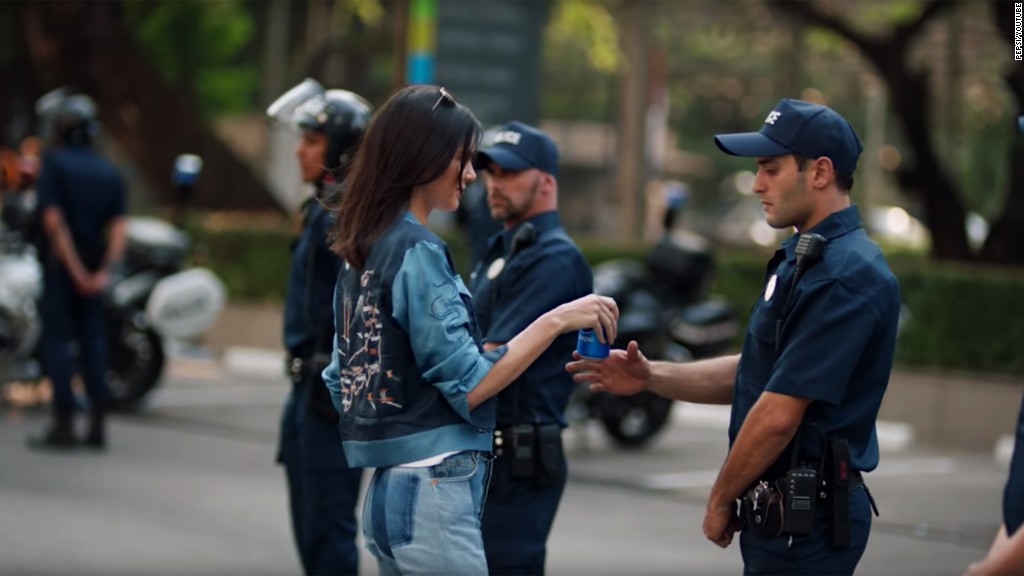
1. A distinct audience for the ad is kind of hard to determine due to the fact that so many different races,classes and types of people were included in the video. I think this ad was meant to target millennials, more specifically young people who are interested in/involved with all the recent protesting like Black Lives Matter, Woman's March, and Donald Trumps Inauguration.
2. I think that this ad would be classified as a populist ad. It would be populist due to all the different races,genders,classes, and people in the video. The tradition that it relies upon is the recent uprising of protests.It is unclear what they are actually protesting about in the video but they are trying to make it seem like Pepsi is the answer and stops protests.
3. My prior knowledge of this product is significant. I know that this is a carbonated drink that is very popular. I know that it could be very addicting and tastes very good. It is also an unhealthy drink that contains a lot of sugar and some caffeine like any other soda. Having prior knowledge of the drink before seeing the advertisement would be helpful but not overly. I don't know what Pepsi was thinking but somewhere they went horribly wrong. I don't think that this ad was a god approach at all and it doesn't make sense to be connecting a carbonated drink to real world problems.
4. This ad is trying to make its viewers think that Pepsi is so good that it can stop protesting and solve real problems. I imagine that this could play upon your emotions that want you to do good things and make the world a better place. Also it could play upon diversity since it includes so many different people. The truth is no police officer is actually going to care if you hand them a can of Pepsi. If anything that would probably somehow just be insulting and they would arrest you.
5. This ad featuring Kendall Jenner actually caused a whole bunch of controversy in the world. Pepsi seriously had to take this ad down because people were getting so offended and I could see how. I think what is happening in this ad is:
At the beginning it shows people being very involved and focused on themselves and their own lives. Outside they hear protesters and it distracts them. They take a swig of Pepsi and are immediately compelled to go join the protest and make a difference. Thats when it comes to Kendall Jenner who is in the middle of a photo shoot. She ditches her wig and lipstick and joins the Pepsi party and is ready to make a change. The next part is what really offended people. The fact that Kendall can walk up and hand the police officer a can of Pepsi and he is immediately compelled to change his mind and be happy. A lot of people thought this was insulting towards the BLM movement and actually was made to recreate this photo of Leisha Evans during the Baton Rouge protests last year.

The truth is Pepsi does not solve world problems. A can of Pepsi may give you a sugar high but I don't think it will affect your view on serious world problems that can't be solved by a blue can of soda. I think Pepsi really missed the mark on this one and did a good thing by apologizing and taking it down.
Deconstructing an Advertisement

STEP 1: MAKE OBSERVATIONS
1. The person depicted in the ad is a young, very attractive, Caucasian woman. She is wearing tight jeans and a short button up shirt that is buttoned down in the chest area and reveals her stomach and a tiny bit of cleavage.These tight clothes define the curves of her body.
2. The camera angle is eye level and is farther away from the subject.
3. The light appears to be artificial. There is good lighting and it makes the woman stand out from the background. No areas of the photo seem to be drastically highlighted. There don't seem to be any shadows either.
4. The ad doesn't have any colors that stand out drastically but has a rather plain and simple feel. The background is plain grey with nothing else so it doesn't take away from the model and her milk stache.
5. The text in this ad is actually very small and its kind of frustrating. The largest text is their slogan "got milk?". The medium size font says "model behavior" as almost like a title of the ad. Also providing some lowkey hints that this is supermodel Gisele Bundchen; wife of NFL Quarterback Tom Brady. The small text is the spiel about milk and how it helps your body. This is the smallest text because its probably the least important in this context and they want to focus on the fact there is a model drinking milk. The font is very plain and simple. Nothing about this ad is overly eye catching and distracting.
STEP 2: DETERMINE THE PURPOSE OF THE AD
1. The product being sold is milk, more importantly cows milk.
2. Milk being the product I don't find it overly appealing. I think they try to make the ad very appealing because the product is so ordinary.
3. The target audience for milk is usually everyone. This ad is mostly targeting young people and more precisely possibly young girl??? I find an audience for this ad kind of hard to interpret because the product is just plain old milk. I think using an attractive young woman as the conveyor of the message might make them think by drinking milk they will look like her.
4. I think the ad is trying to associate feelings of appearance. Again using the super model as the conveyor of the message might make them think by drinking milk they will look like her.
STEP 3: DETERMINE THE ASSUMPTIONS THE AD MAKES & THE MESSAGE IT SENDS
1. I think the assumption made about gender is "Woman can be strong and independent when they drink milk" or "Woman who drink milk don't need a man". I don't find these assumptions realistic because milk doesn't make you independent. It is no longer acceptable to think that woman must depend on a man to do everything. Woman are strong on their own and don't need milk to prove it. These assumptions reinforce stereotypes about gender identity.
2. Assumption: "Caucasian woman are strong and gorgeous from milk and promote positive behavior." It is not realistic for Caucasian woman to be the ideal image of a strong woman. This isn't fair for other races. These assumptions reinforce stereotypes about gender identity.
3. The assumption that could be made is "Classy wealthy people drink milk." These assumptions are not realistic. I find this assumption weird and unnecessary.
STEP 4: CONSIDER THE POSSIBLE CONSEQUENCES OF THESE MESSAGES
1. Short term consequence: Possibly having low self esteem compared to the model in the ad.
Long term consequence: Always connecting Gisele Bundchen to milk. People that don't like her might not want to buy milk because she was involved.
I seriously am trying my best here becuase those are dumb but I didn't think a stupid milk ad could have consequences??
2. The text and fact that the ad provides is realistic. The message from this ad that could be seen as realisitic would be the model and since she drinks milk you should too."Model behavior" And unrealistic expectations that milk could make you look like her.
3. I think this ad does undermine social change by sending out an unrealistic message that you could look like this model.
4. An ad that is socially responsible must meet an ethical standard. The ad cannot be seen as deceptive by its viewers, I think this ad appears socially responsible but could be interpreted differently to others who take a milk ad more seriously.
5. To think of yourself primarily as a citizen would be someone who has greater values and isn't just looking out for oneself but rather a community and others well being. Basically a better person who is on a higher level compared to everyone else. A citizen would be a general person who isn't exactly so responsible and determined to be different and help the community. I think everyone is a mixture of citizen and consumer but everyone should aim to be a citizen rather than consumer in order to improve our lives and community.
Appealing to Your Audience

1. The speaker of the ad is Unicef. Unicef is an organization that provides humanitarian and developmental assistance to children and mothers in developing countries.
2. The audience that Unicef is intending this ad for would probably be anyone that is fortunate and in a good state willing to donate. This ad would appear in wealthier countries.
3. I know that the intended audience is wealthier, better off people because of child depicted in the ad. The child is a young African boy that is crying and looks poor.
4. Using the young boy as a model evokes peoples emotions and guilts/persuades them into donating and helping other people just like him.This ad is an example of PATHOS.
Friday, 12 May 2017
The Language of Advertising Claims
1. THE WEASEL CLAIM

2. THE UNFINISHED CLAIM
3. THE "WE'RE DIFFERENT AND UNIQUE" CLAIM
4. THE "WATER IS WET" CLAIM
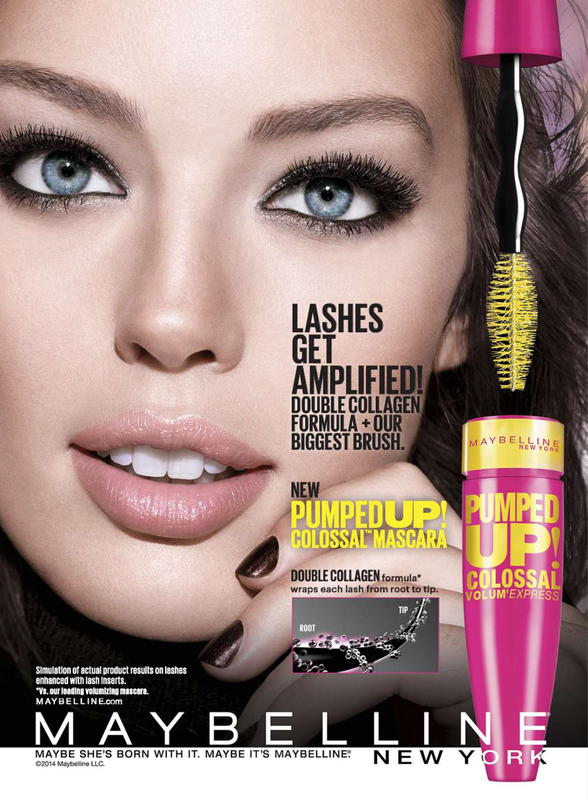
5. THE "SO WHAT" CLAIM

6. THE VAGUE CLAIM
7.THE ENDORSEMENT OR TESTIMONIAL

8. THE SCIENTIFIC OR STATISTICAL CLAIM

"includes RESTYN" What exactly is this unknown ingredient?
9. THE "COMPLIMENT THE CONSUMER" CLAIM
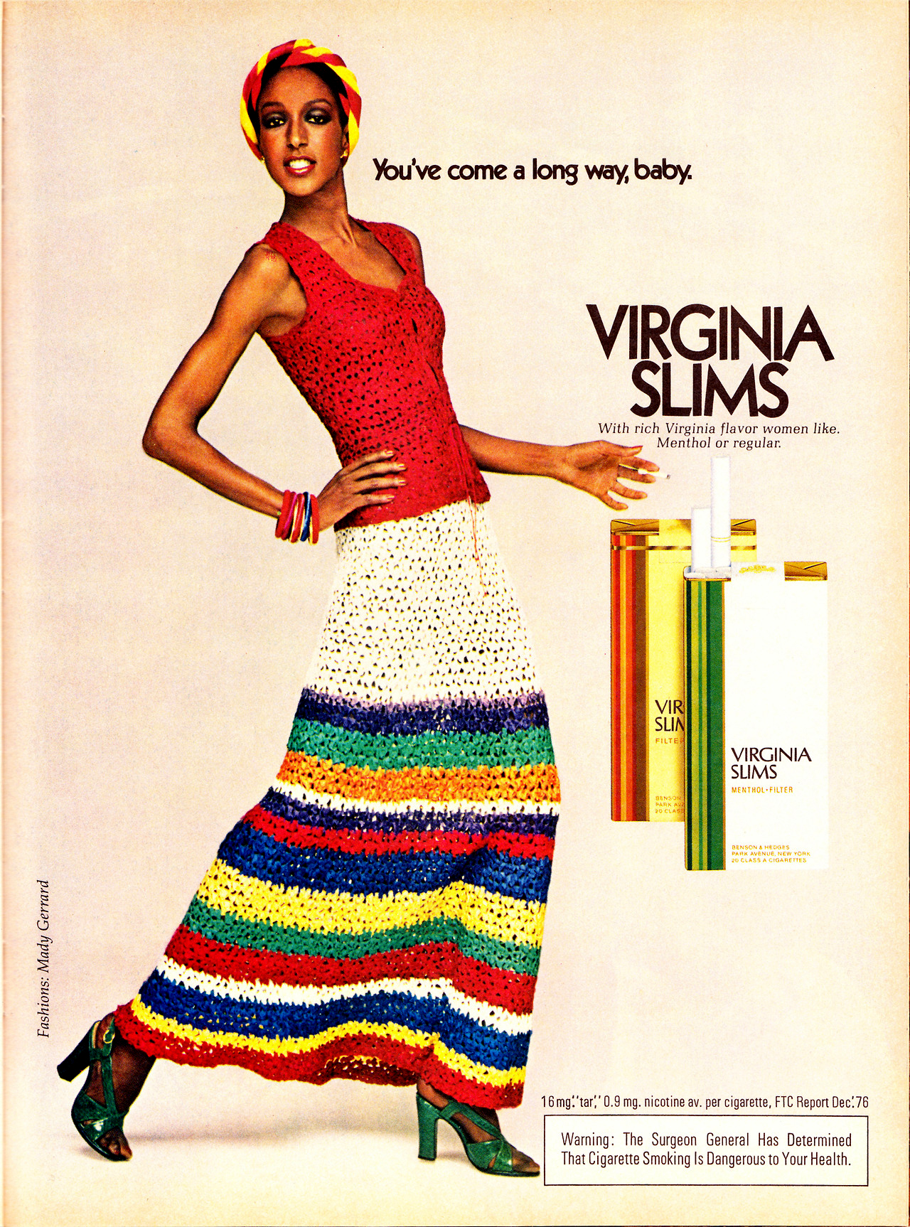
10. THE RHETORICAL QUESTION CLAIM


2. THE UNFINISHED CLAIM

3. THE "WE'RE DIFFERENT AND UNIQUE" CLAIM

4. THE "WATER IS WET" CLAIM

5. THE "SO WHAT" CLAIM

6. THE VAGUE CLAIM

7.THE ENDORSEMENT OR TESTIMONIAL

8. THE SCIENTIFIC OR STATISTICAL CLAIM

"includes RESTYN" What exactly is this unknown ingredient?
9. THE "COMPLIMENT THE CONSUMER" CLAIM

10. THE RHETORICAL QUESTION CLAIM

Wednesday, 10 May 2017
VAPID Ad
VOICE:
- The voice speaking in this ad is Mercedes-Benz, a car company promoting one of their vehicles.
- Mercedes-Benz is a well known car brand and in this case would be a credible voice for promoting their own vehicle.
AUDIENCE:
- This ad probably appears on websites selling vehicles and in car dealerships.
- The audience that this ad is directed toward would be younger individuals looking to buy an expensive sports car.
- Not trying to be offensive but a common stereotype I would see driving this car would be handsome,rich, young white males just like the man pictured above in the ad.
- Being that this is a car ad I don't think that the writer is taking advantage of the reader. Just simply promoting a feature in their vehicles.
PURPOSE:
- The apparent purpose of the ad is to advertise one of the features that Mercedes-Benz has installed in their vehicles.
- The actual purpose of the ad is to simply advertise the newest and coolest features in their product in order to sell more vehicles.
- Not necessarily a public service but the ad claims to offer a Blind Spot Assist service while driving.
- The ad does fulfill the promises of the ad. There is a Blind Spot Assist feature in their cars.
- The ad could potentially be concealing negative features about the product. In this ad they are only focusing on the Blind Spot Assist feature and not including other important aspects about the vehicle.
IDEA:
- The central idea of the ad is their Blind Spot Assist feature that they have in their cars. The focus of this ad is again the Blind Spot Assist feature. They use this ad to promote one cool feature which will encourage people to buy the car.
- This ad appeals to reason. The optical illusion is a good way to get peoples attention and draw them in to their product information.
- I don't think that this ad appeals to any of the "Seven Deadly Sins". They ad just uses a optical illusion and I don't think that is a deadly sin.
- This ad does not try to impress the viewer with impressive data or facts. They try to impress the viewer with the optical illusion. There is very little amount of text and the idea is clear and simple.
- I have never been in or driven a Mercedes-Benz so I haven't experienced how the product actually works. But the ad does make general claims that have not been proven fake as far as I know.
DEVICES:
- The overall design of the ad is simple and not too busy. Yet the ad isn't too boring or plain. Less is More.
- The attention getting ploy used in this ad is the optical illusion.This ad includes a photo of a man that appears to be looking both forwards and to the side. The company is basically promising you will be able to know your surroundings in front and beside you at all times in the vehicle.
- The person included in this ad is young white male. He seems to be wearing a dress shirt which could contribute to the fact that he is professional/sophisticated. Only seeing half of his face it is hard to tell but I assume that he is attractive and has good morals. This is probably the most common stereotype you would see in ads.
- The man in this ad is positioned large to the left and takes up almost half of the page. Being that there is not much else in the ad you can obviously tell he is the main subject.
- Only seeing the mans one shoulder in this photo makes it hard to tell what he is actually wearing. I am going to assume though that he is wearing a dress shirt in order to look more clean cut and professional. This car company is aiming for young classy men like him to buy their vehicles.
- There isn't really much to this ad. The background is plain and simple along with the message. The only graphics used in this situation is the optical illusion and that's really all they need.
- The product isn't actually shown in this ad, they are only promoting a feature in their car. It's not clear how the vehicles actually look.
- Since the product isn't shown the only other image is the optical illusion. In terms of size it takes up around 1/3 of the ad. I think this is a good size because the background is very plain and it has a lot of blank space.
- The use of color is very dull and it could be improved to make the ad more eye catching and not so boring.
- Since there are literally only two sentences on the ad,they don't provide much information about their product other than their Blind Spot Assist feature. The second sentence confirms the feature can allow you to look to the side without looking to the side.
- This ad is implying that you should buy their product if you want to be able to look to the side without looking to the side and drive safer.
- This ad is stating that you can drive safer with their vehicle because you will have better knowledge of your surroundings.
- The font is the classy Mercedes-Benz font and is simple to read. I think that this is just a bad quality photo and that the print being so small sint actually a tactic, its just a mistake and makes it hard to read.
- There isn't exactly any small fine print so I don't think the ad is trying to hide anything.This could possibly be why the ad is so plain. They wouldn't have to include small fine print with disclaimers or restrictions.
Monday, 8 May 2017
A Checklist for Analyzing Images

1.This ad incorporates bright colors and two large objects being the old lady and the cake. Overall I would say that this ad is eye catching and colorful but isn't too busy and relays a simple message.
2. The part of this ad that caught my attention immediately was the old lady blowing out birthday cake candles. The two objects are very large in the center and take up most of the poster. At first the ad almost seemed funny but looking closer you'll see that its actually a serious message. The funny pictures were a good way to draw you in.
3. The audience that this ad is directed at is young smokers. Although it may not seem this way because of the big old lady, this ad is actually sending a message about how smoking causes premature aging. If you look you'll find that she looks around 80 years old but is blowing out candles that say 42.
4. I think the image appeals to our emotions using fear. The message of this ad is supposed to scare you into not smoking unless you are planing on looking like this lady while you are only 42 years old.
5. This ad appeals to our character as a good human being. The ad is basically saying that if you do not smoke you will live a long healthy life and you'll never look like this ugly old lady. If you don't smoke you are a good person.
6. I find that the print goes hand in hand with the image. The image is big and eye catching and draws the viewer in. The images serves and attracts us and leads us on to read the text. There is not a lot of text so it doesn't bore the viewer and it sends a simple and clear message.
Subscribe to:
Comments (Atom)
Reading Media Photographs
WHAT DO YOU SEE? Nonverbal gestures: Everyone's limbs seem to be relaxed. They aren't communicating with their hands. ...

-
"VERY TIME CONSUMING" My experience with Moovly started out slow. I must admit I found it hard to use and just overall very...
-
Watch Pepsi Ad Here 1. A distinct audience for the ad is kind of hard to determine due to the fact that so many different races,c...
-
VOICE: The voice speaking in this ad is Mercedes-Benz, a car company promoting one of their vehicles. Mercedes-Benz is a well k...

